By Laser 1 Technologies
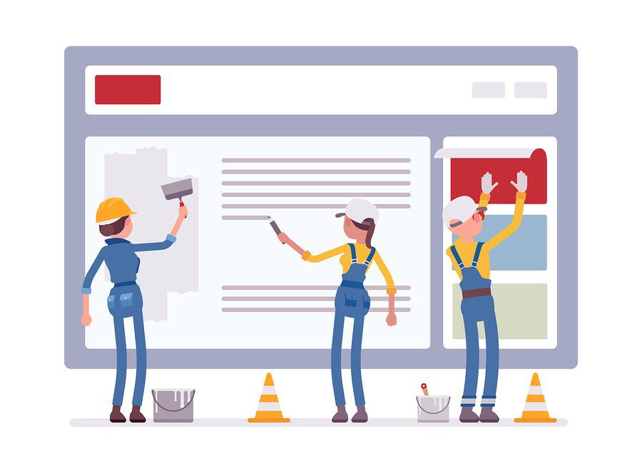
Common Mistakes on Manufacturing Websites
No one has time for a confusing, slow website.
Your website is usually the first point of contact you have with a new customer, and it needs to make a positive impression, fast.
We’ve all experienced websites that turned us off. It doesn’t load in 2, 3, 4 seconds? We’re out. That new restaurant has gorgeous images, but the hours or address are hard to find. Another site takes too long to load, it’s hard to navigate, the font is hard to read…. the list goes on.
Commit any of these errors and you’re damaging your own credibility and pushing prospects to your competition. You might have the best product/customer service/prices, but they’ll never find out if your website doesn’t function well. Fail to make a positive impression in the first 10 seconds or so, and you’ve missed your opportunity.
A website doesn’t have to be fancy, but it needs to be up to date, functional, and–above all–user friendly. Screen your site for these mistakes.
Your Website Doesn’t Reveal Instantly What Your Company Does and Your Unique Value Proposition
Once your page loads, the viewer forms an impression in about one second. Make sure your services/products are obvious, along with confidence-building elements like awards, testimonials, and industry affiliates.
Your Website Takes Too Long to Load
Life moves at warp speed, and the back button is everyone’s favorite tool while browsing. People will use it–don’t tempt them.
Your Website Isn’t Mobile Optimized
Grab your phone, hop on your site and navigate. Today’s internet users spend more time on mobile than on a desktop, and that trend increases drastically among millennials. Your site must be responsive, which means it will gauge the screen size your visitor is using and adjust accordingly. Images and links need to perform equally well on a mobile phone as they do on a desktop.
A responsive site must have links and buttons big enough to click confidently. If visitors can’t navigate because the buttons are the size of a pinhead, they’ll give up.
Your Website Has Too Many Links that Open New Windows
Opening too many windows can lead to a bad user experience, especially on a mobile device. Why? They lose the easy functionality of the back button, and they gobble up bandwidth, slowing down the device.
Your Site Isn’t Intuitive
Navigation must be simple, information must be easy to find, and the search function must be obvious. The bulk of your information should be found in just a click or two, so avoid overwhelming the visitor with too much information.
Your Contact Information Is Hard To Find
Inviting contact from visitors is arguably your top goal–make it easy. Place a “contact us” tab in the navigation panel, consider including contact information above the fold, and put contact info in the footer so it’s easy to locate on every page. A fillable form for contact is fine, but also give visitors the option of contacting you at an email address, so they’ll be able to refer back to their message and your contact info.
You Fail to Capture Customer Information
Creating a homepage or pop-up opt-in offer that appeals to your visitors. At the very least, make it exquisitely easy to sign up for your email list–don’t make them hunt. Better still, tempt them with a lead magnet such as a discount, a useful PDF or an EBook.